

Why Most Photographers Don’t Actually See Contrast
Understanding what your eyes notice and your camera ignores

Most photographers think of contrast as a slider, something you fix later with a quick move in Lightroom.
But real contrast is not something you add, it is something you see or miss completely.
Our eyes are master deceivers. They constantly adapt, stretching dynamic range, correcting colour shifts, and making every scene appear balanced. The camera has no such generosity. It records exactly what is there, nothing more. That is why what looked brilliant to you in the field so often feels lifeless on screen.
Contrast is not about black and white, it is about separation. The way light defines form, the way colour and tone carve space out of chaos. Once you start noticing it, you realise how many photographers walk through the world blind to what the light is actually doing.
Contrast does not always shout. Sometimes it whispers.
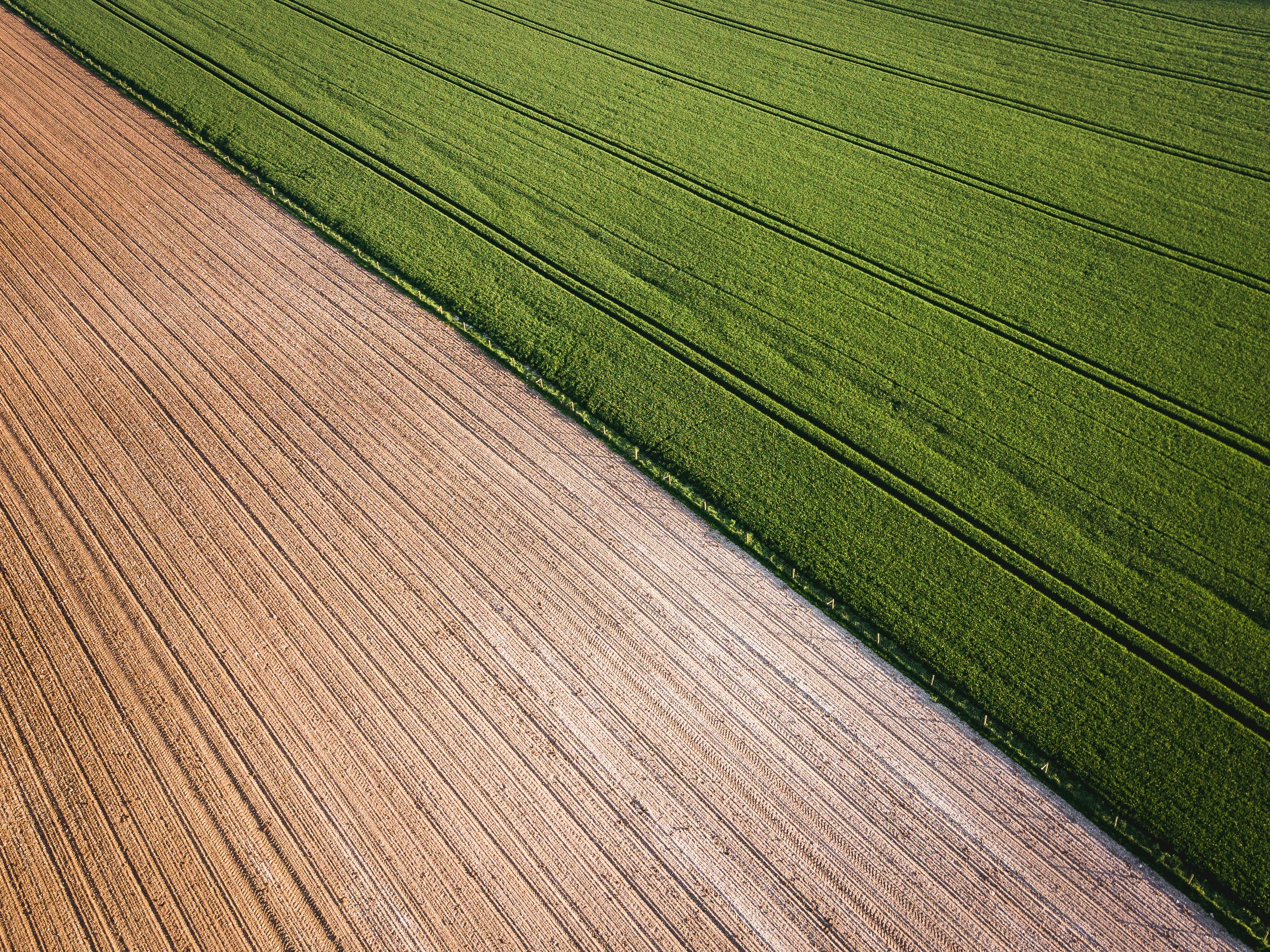
I made this photograph in the borderlands between Hungary and Slovenia, where the countryside folds gently into itself — green fields meeting pale soil, texture meeting stillness.
There is no harsh light here, no deep shadows, yet the separation is undeniable. The ploughed earth and the living crop create two different rhythms, one etched by man, the other grown by time. The photo works because of their quiet opposition, a reminder that contrast is not only about brightness, but about tension between surfaces, materials, and life itself.
Learning to see this kind of subtle contrast trains your eye to look beyond light levels and notice texture, tone, and meaning. Once you start paying attention to that, you realise the world offers more visual variety than any slider ever could.
Now compare that with a foggy morning in Venice. The outlines of palazzi melt into air, yet delicate tonal layers rise from the mist. Or think of a midday walk in Budapest when the sun is merciless, turning every edge razor sharp and shadows into solid geometry. Both situations are rich in contrast, though they could not be more different. The key is to recognise what kind of contrast each scene is offering before you even lift the camera.
Good light does not always mean strong contrast. Sometimes the best photographs come from restraint, from noticing the quiet transitions between tones, not just the dramatic ones.
Three types of contrast that matter
Luminance contrast – the pure difference in brightness between two areas, the element that gives form and depth.
Colour contrast – warm versus cool, complementary hues that fight for dominance or work in harmony.
Subject contrast – emotional or conceptual opposition, youth versus age, chaos versus order, beauty versus decay.
If your work feels flat, it is usually because one of these layers of contrast is missing. Many photographers overexpose to make an image brighter when in fact the scene simply lacked separation. Exposure can fix technical errors, but it cannot invent contrast that was never there.
The solution is to train your eye to see contrast the way your camera does. Start by squinting. Literally. Narrow your eyes until colour fades and only tone remains. That is how painters judge form and value before starting a canvas. Do the same before every shot. See the structure of light, not just the subject itself.
Once you begin doing this, you start composing with tone instead of shapes. You begin to see where the light falls, how shadows connect, how edges define the rhythm of an image. You stop reacting and start constructing.
Here’s where it gets interesting. Once you understand contrast, you can control it without touching a single slider.
If you enjoyed this post and want to dig deeper into how I approach gear, craft, and discipline in photography, these pieces expand on the same mindset.
Paid subscribers can also access my short contrast exercises and field notes from recent assignments.